2026 · Freelance Product Designer & Developer · B2B, Research, Visual design, Design system, Front-end build
A wholesale food maker with a website last touched in 2020. I took it from discovery to a new site: research with the client and their sales team, quick AI concept sketches, six rounds of homepage design, a Figma design system, and a hand-built site that sends buyers to the right door. AI was part of every step, from proposals to DNS fixes, and it let one designer move like a small team.
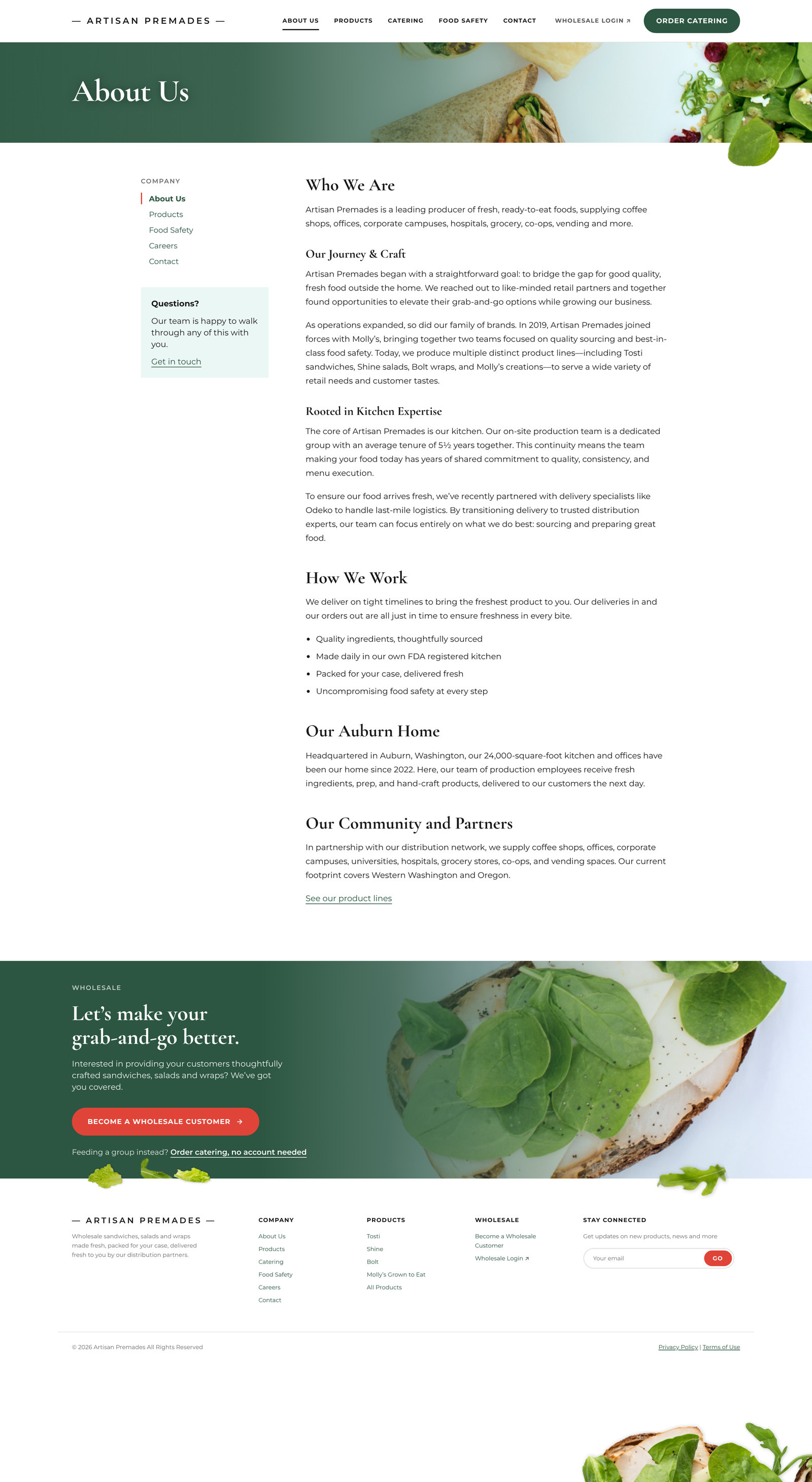
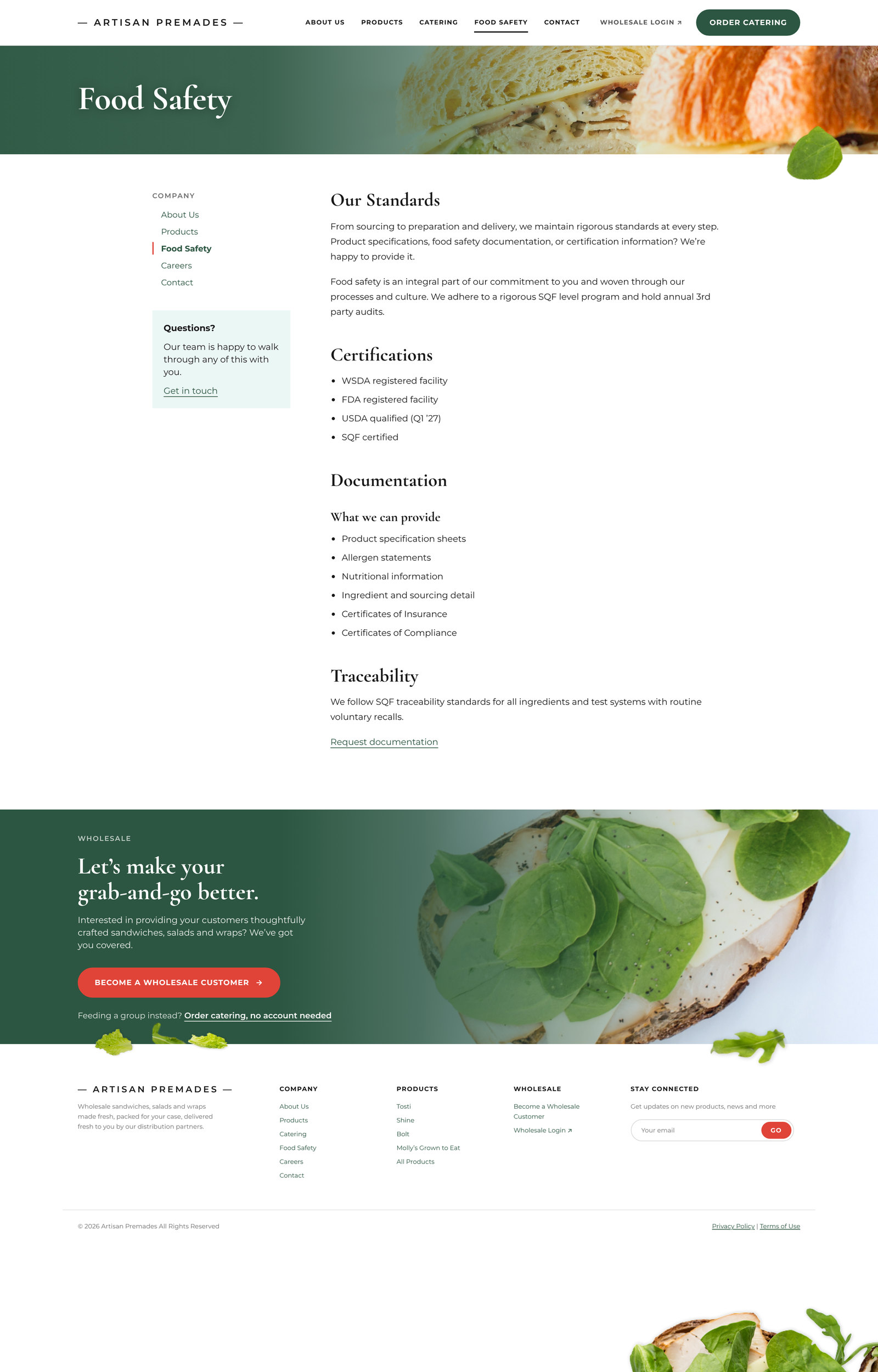
Artisan Premades makes grab-and-go sandwiches, salads and wraps in an FDA registered kitchen and sells them wholesale. Their customers are coffee shops, offices, corporate campuses, hospitals, grocery stores and co-ops. They run four product lines: Tosti sandwiches, Shine salads, Bolt wraps, and Molly's Grown to Eat.
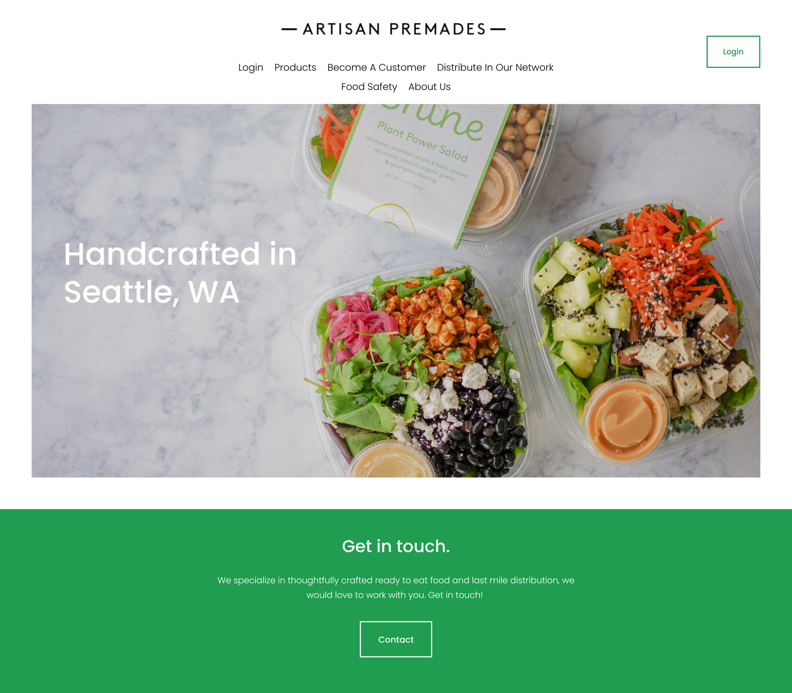
The food was good. The website didn't show it. The site hadn't been touched since around 2020. The homepage was a logo, one photo, "Handcrafted in Seattle, WA," and a contact button. Behind it, the products page gave each line one sentence, and food safety got one paragraph. A buyer deciding whether to put Artisan on their shelf had very little to go on, and nothing to download.
I came on as a freelancer to run the whole project: research, information architecture, visual design, the design system, the front-end build, and the move to new hosting.
The people who matter most to this site are wholesale buyers and category managers. Before they commit shelf space, they want to see the food, see the packaging, and get spec sheets, allergens and nutrition. The old site gave each product line one sentence and offered no documents. Existing customers had to know where to log in. New ones had to send an email and wait.
There was a second problem under the first. The project started as a website plus a custom ordering system, and nobody yet knew where the website would live or what it would be built on.
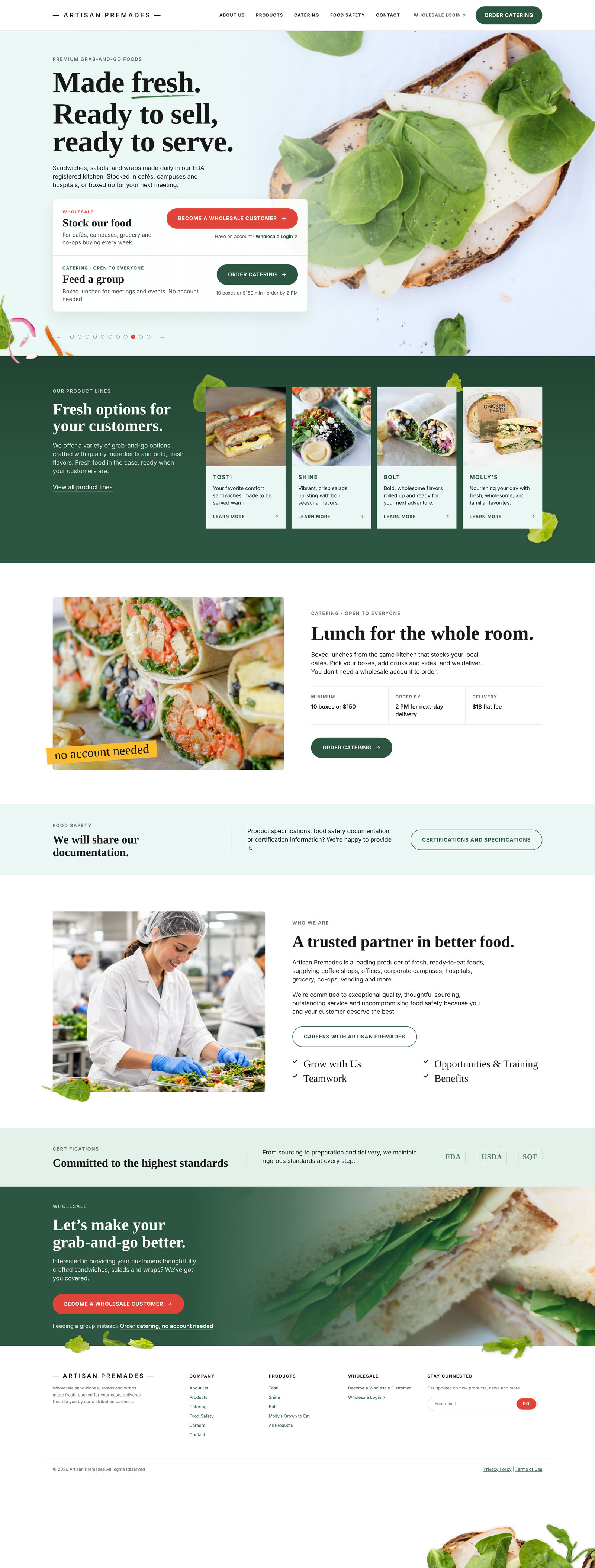
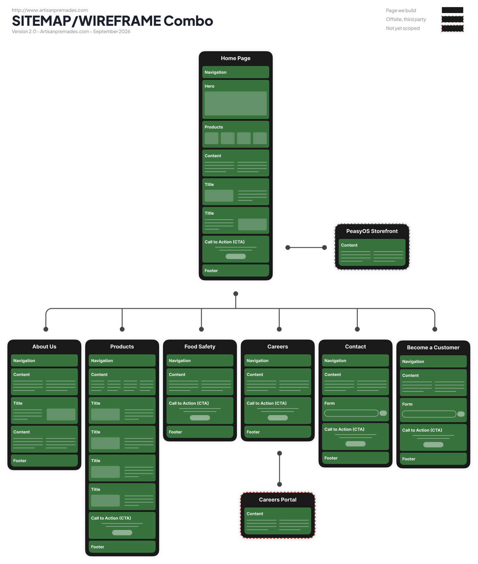
Sitemap and wireframe in one view. The ordering storefront sits outside the site on purpose. Our job is to get buyers to its door.
I started with a kickoff meeting and wrote everything into a living project brief: goals, page inventory, open questions, and who owned each one. Every meeting after that updated the brief, so the client and I were always reading the same document.
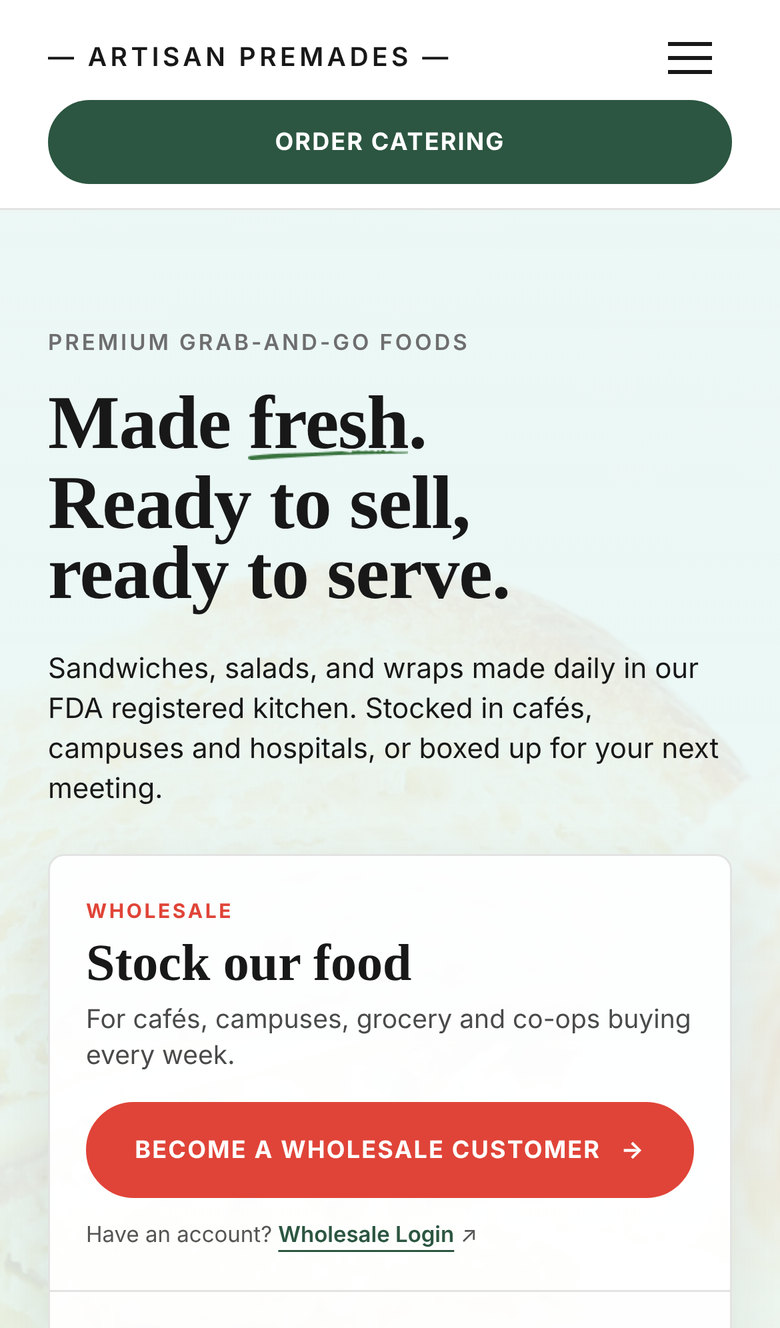
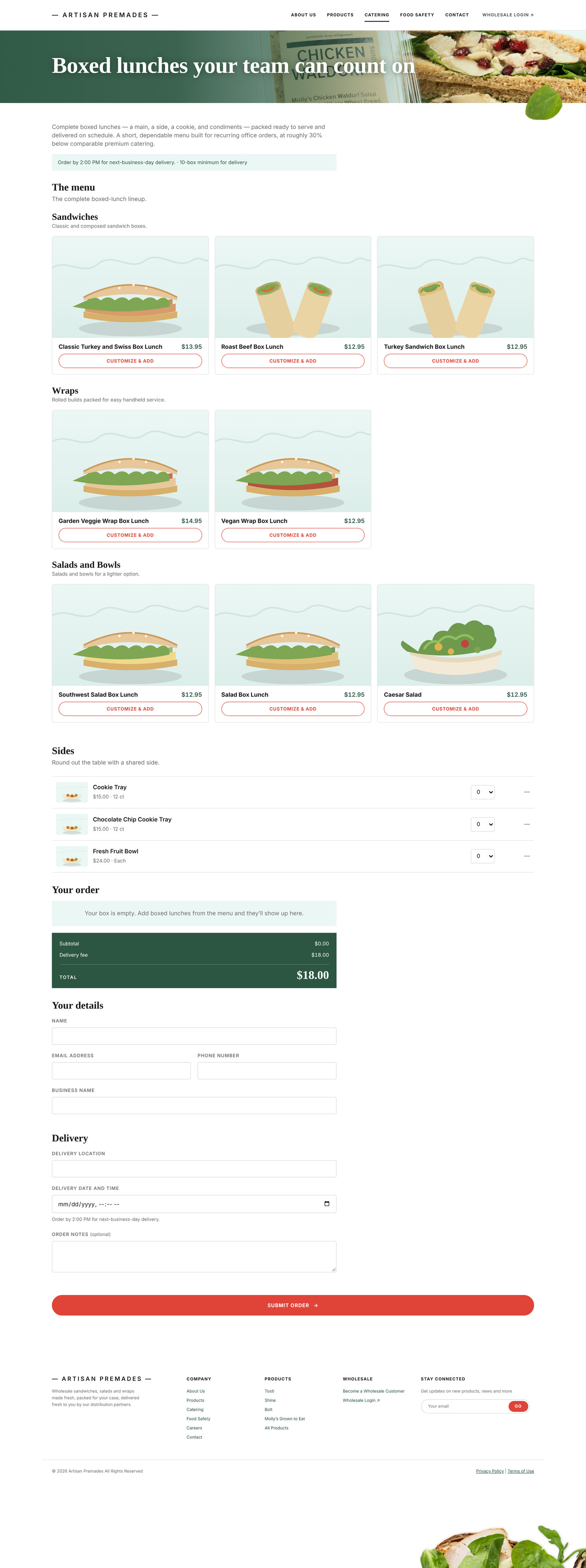
The biggest call came early. I set up a joint meeting with the client and the vendor behind their new ordering platform. It turned out the platform already included a storefront that met the client's needs, at no extra cost. That took the ordering system out of my scope. We dropped a custom storefront, a monthly e-commerce subscription, and an unproven integration. The website became a marketing site with a clear Log In to Order hand-off on every page.
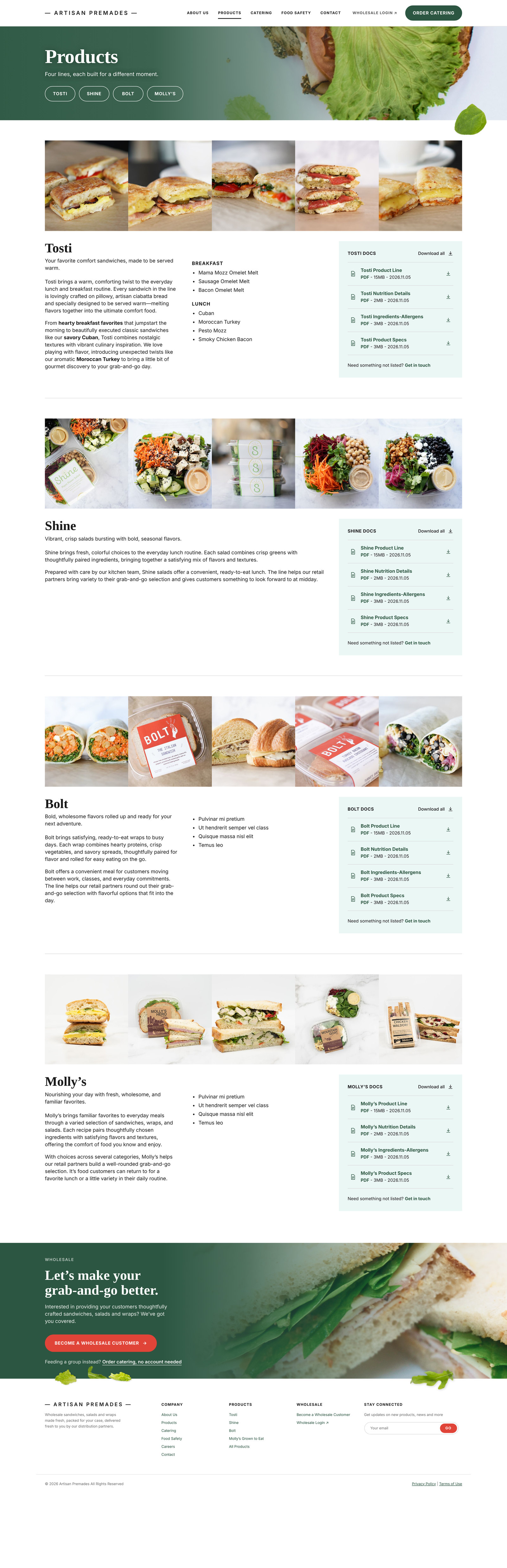
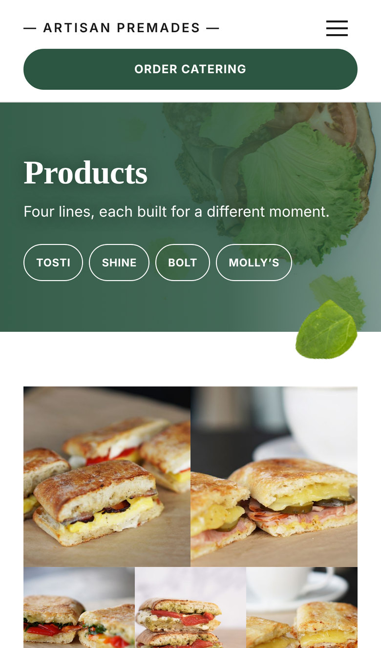
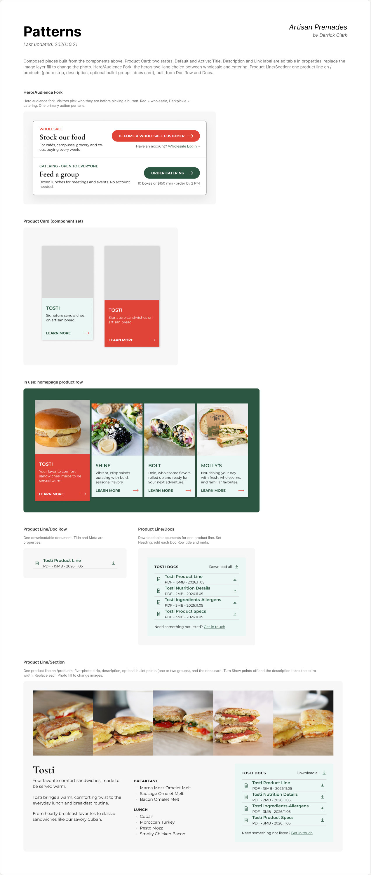
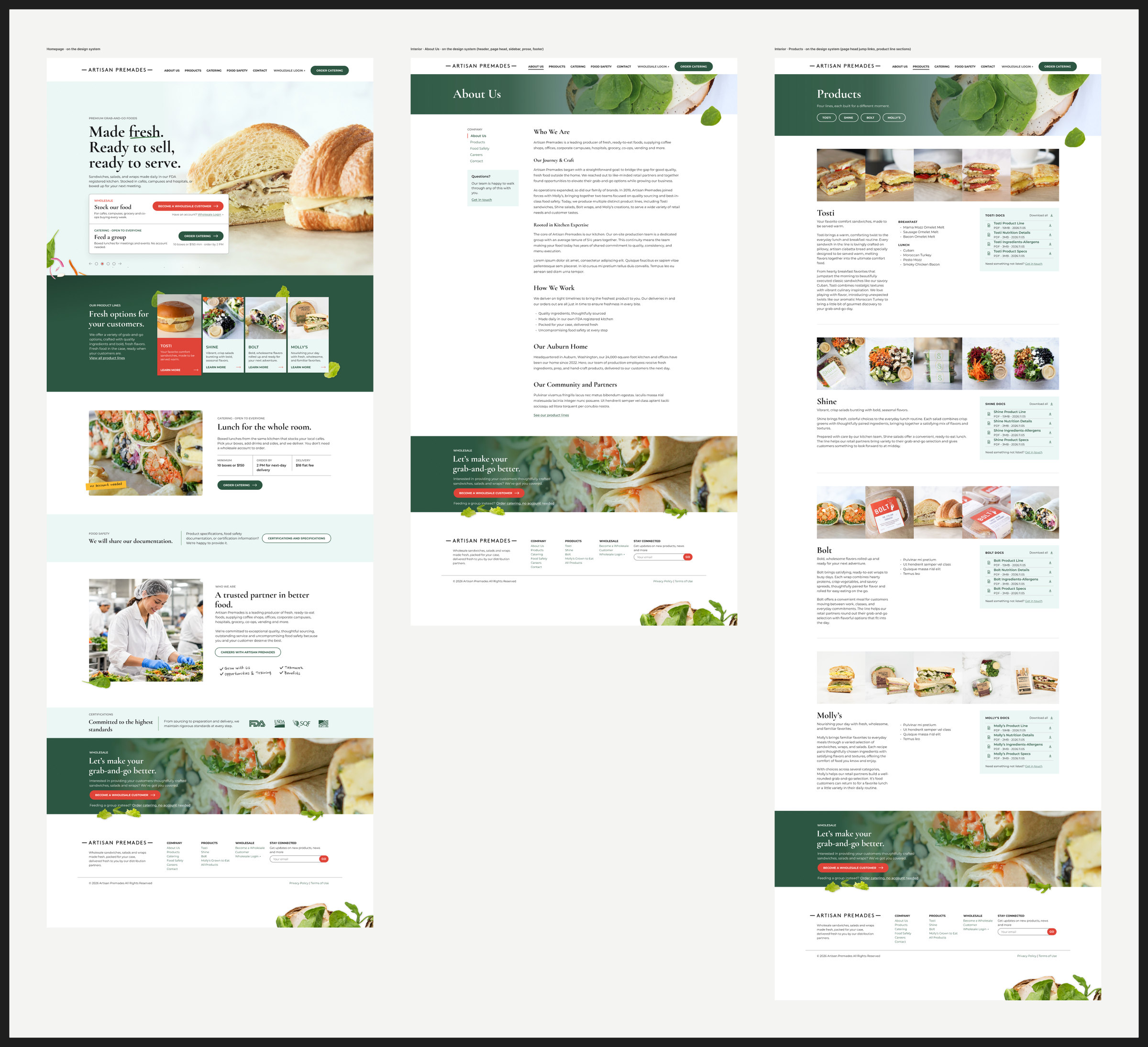
I sat down with their salesperson and walked her through early pages. I asked how she sells, what buyers ask for, and what she wished she could send them. The answers were specific: shelf life, full ingredients, heated or not heated, allergens, nutrition, spec sheets, and photos of the packaging. That conversation became the products page. Every line got a photo bar, a short description, and its own set of downloadable documents.
I ranked the audience: distributor buyer and category manager first, retail merchandiser second, end shopper third. Every design decision after that got checked against one question. Does this make a buyer confident enough to give us shelf space?
The best design decision on this project was taking something out. Moving ordering to the platform the client already had made the site smaller, cheaper to run, and easier to finish on time.
I gathered references from food brands, B2B suppliers and food publications into a mood board, plus a branding board built from what Artisan already had: the wordmark, Molly's greens, and their product photography. Then I put those materials to work. I started with quick, prompted screens to rough out ideas fast, and moved to designed screens in Figma, each round closer to production quality.
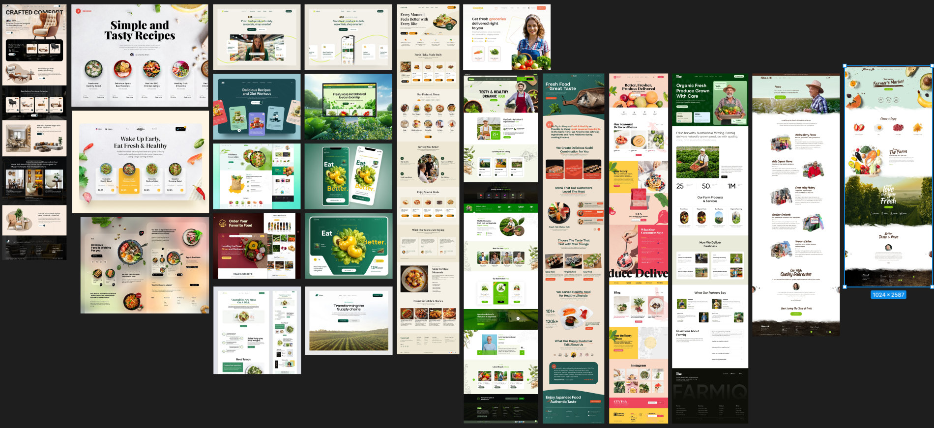
A mood board of food brands, B2B suppliers and food publications. I start every project here, to get my head in the right visual space and learn from work like it.
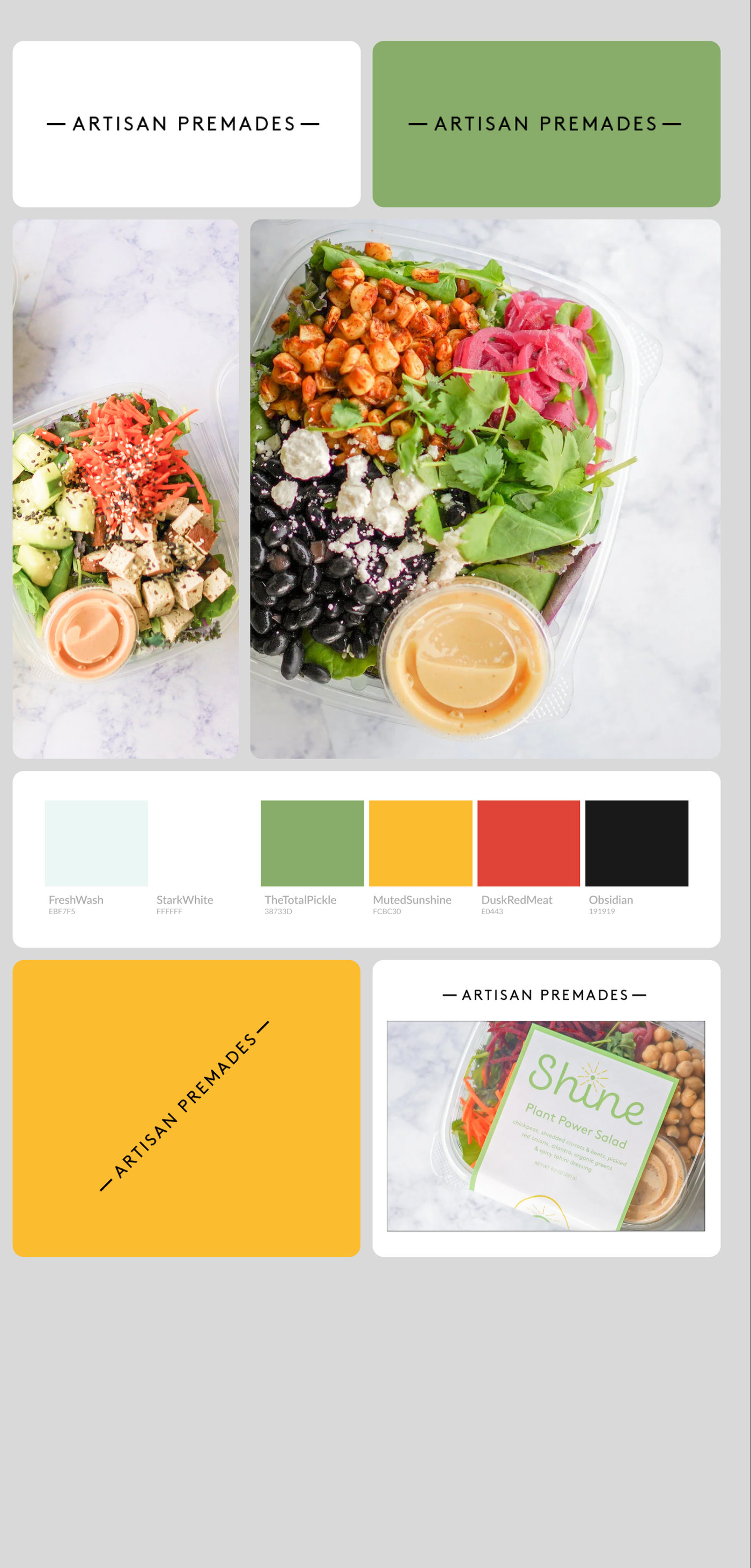
The client's own materials in one place: wordmark, greens, photography, packaging. The first colors and base pieces of what grew into the design system.
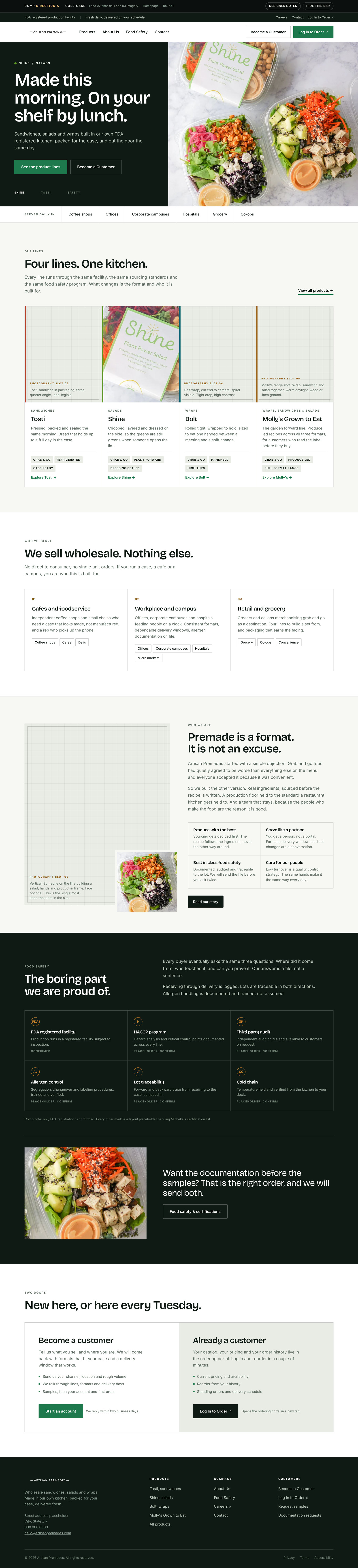

I fed LLMs my wireframe, the logo and photos, and a detailed prompt, and got two layouts on screen fast. A way to think out loud, not a design. Both carry the usual AI tells, and none of it shipped as is.
The real design work started after this. In Figma I shook off the generic AI patterns, the parts that make a page look generated, and worked the layout until it felt made by a person for this client. The next section shows how that went.
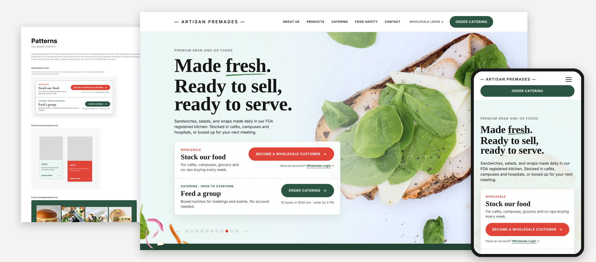
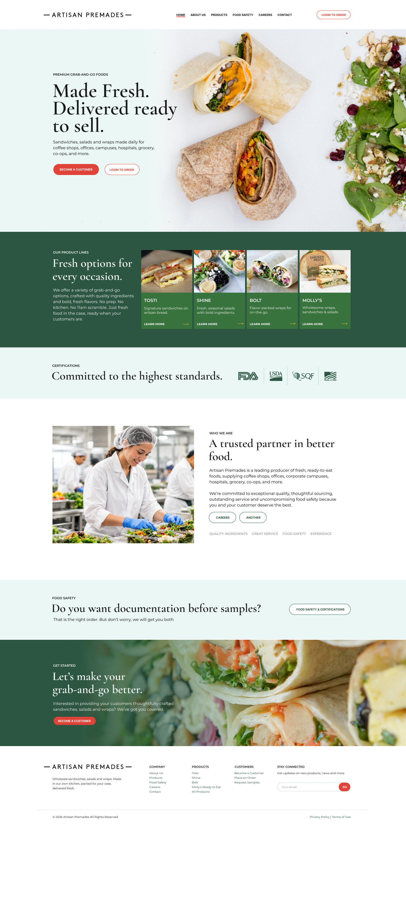
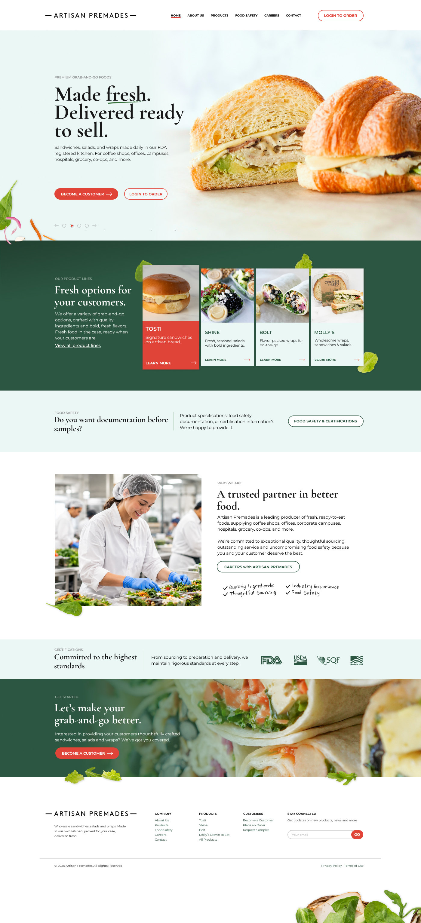
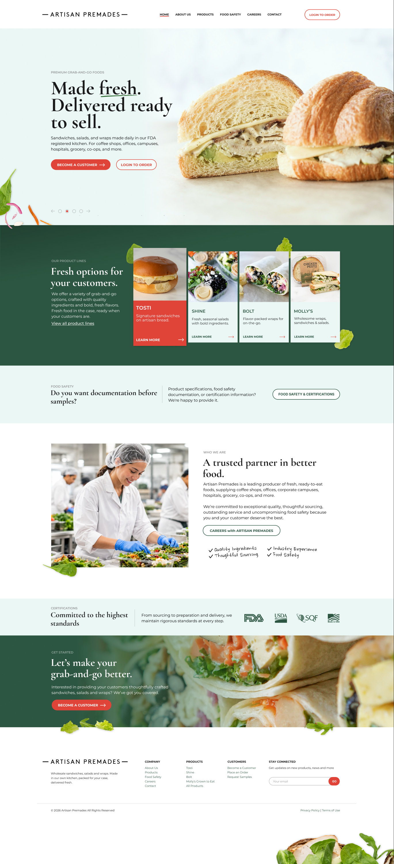
I iterated the homepage over six versions in Figma. The look moved closer to the brand they already had: a serif headline, a mint and deep green palette, and the food doing the selling.
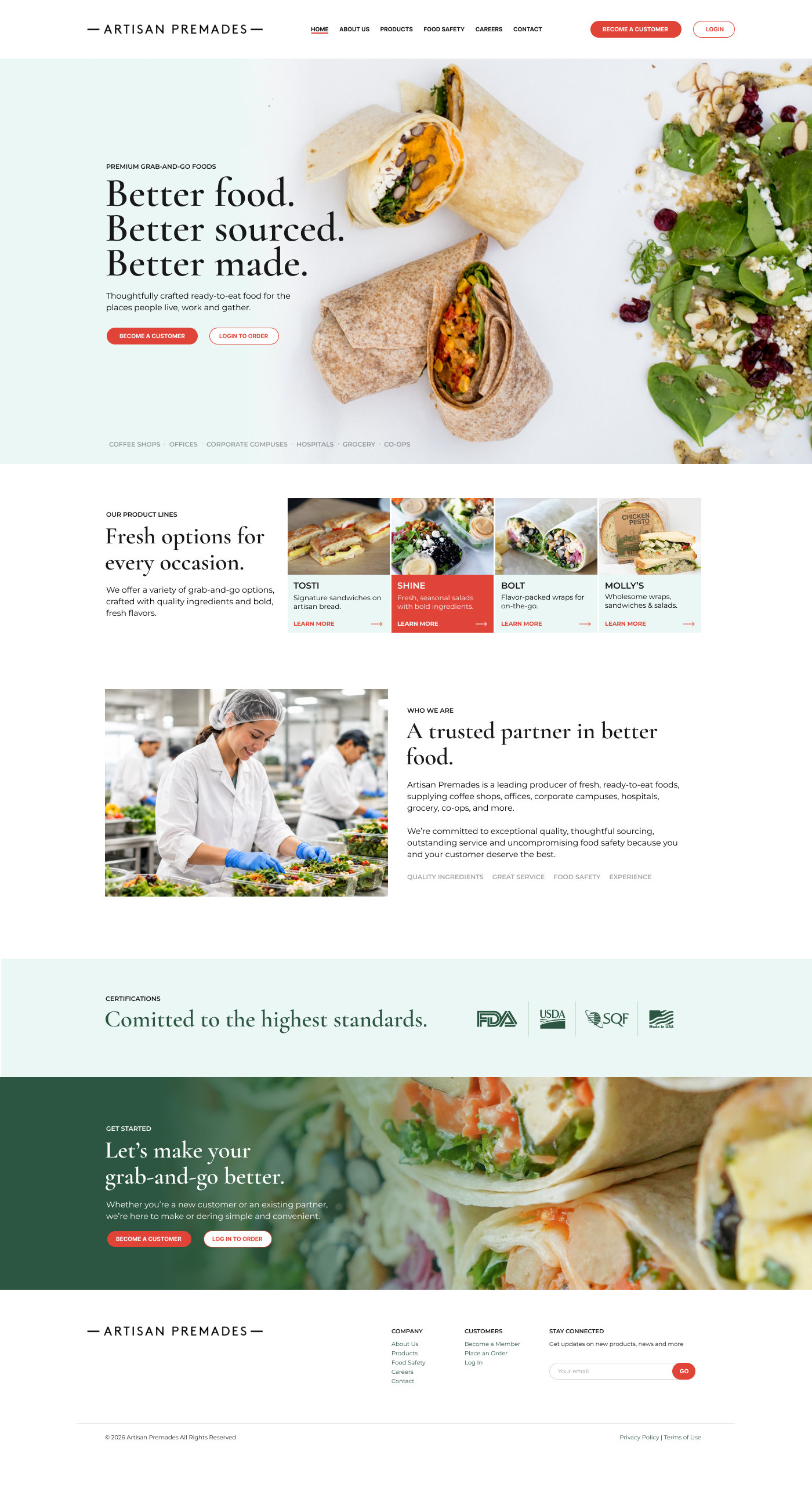
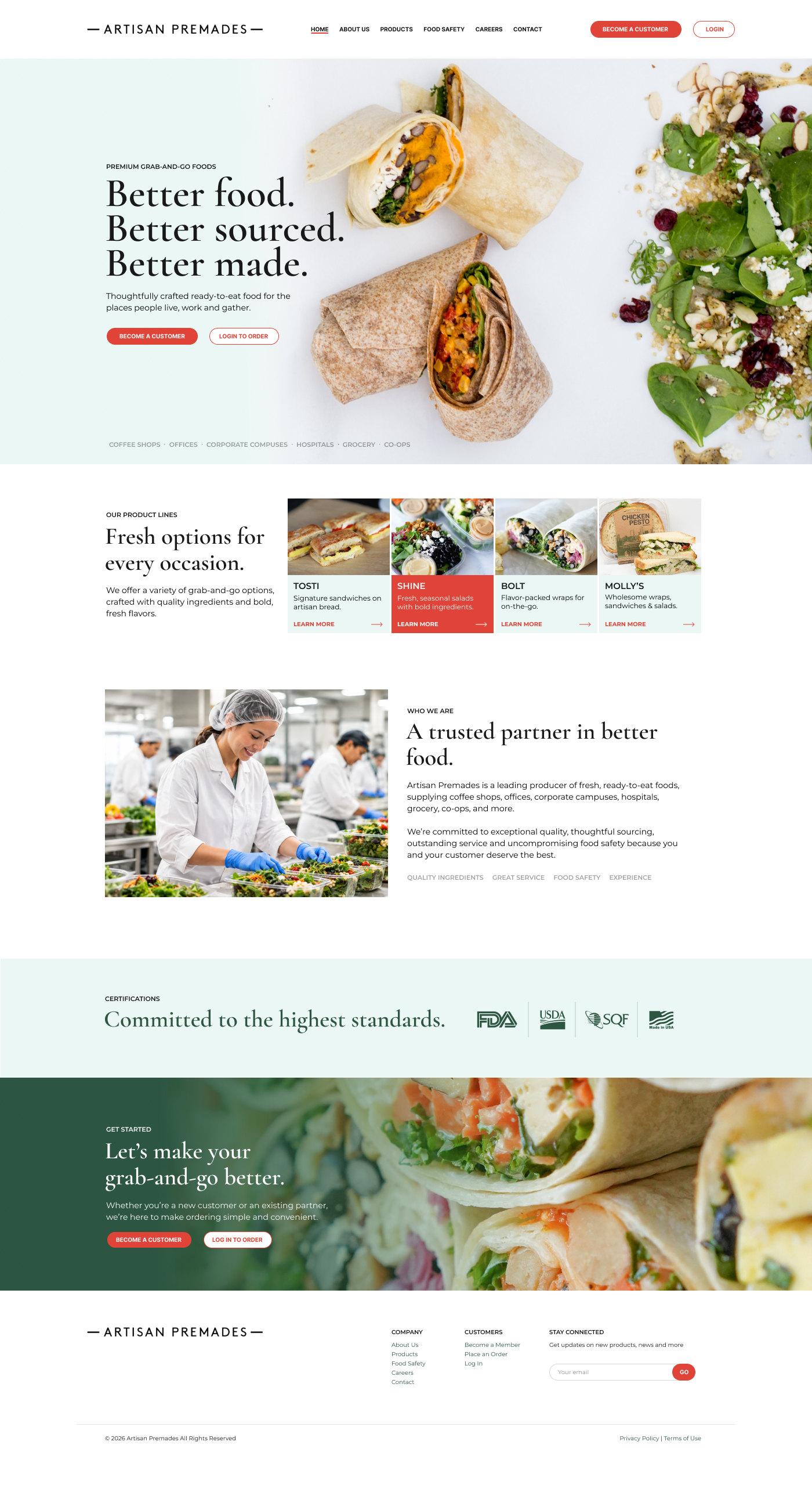
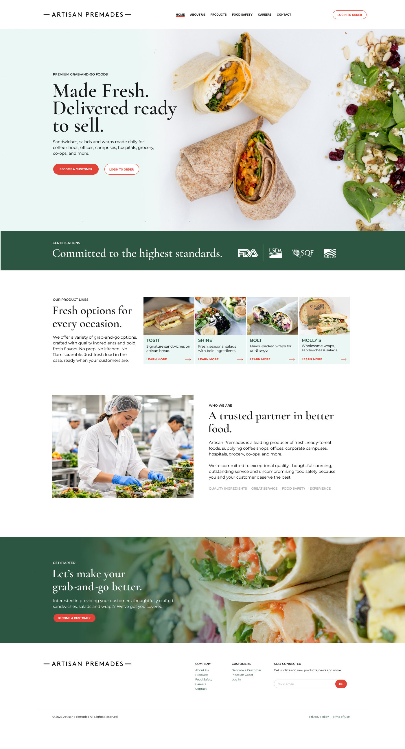
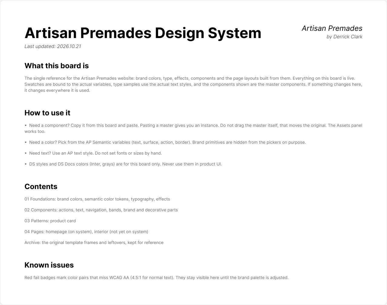
The board explains itself, so anyone opening the file knows what's live and what not to touch.
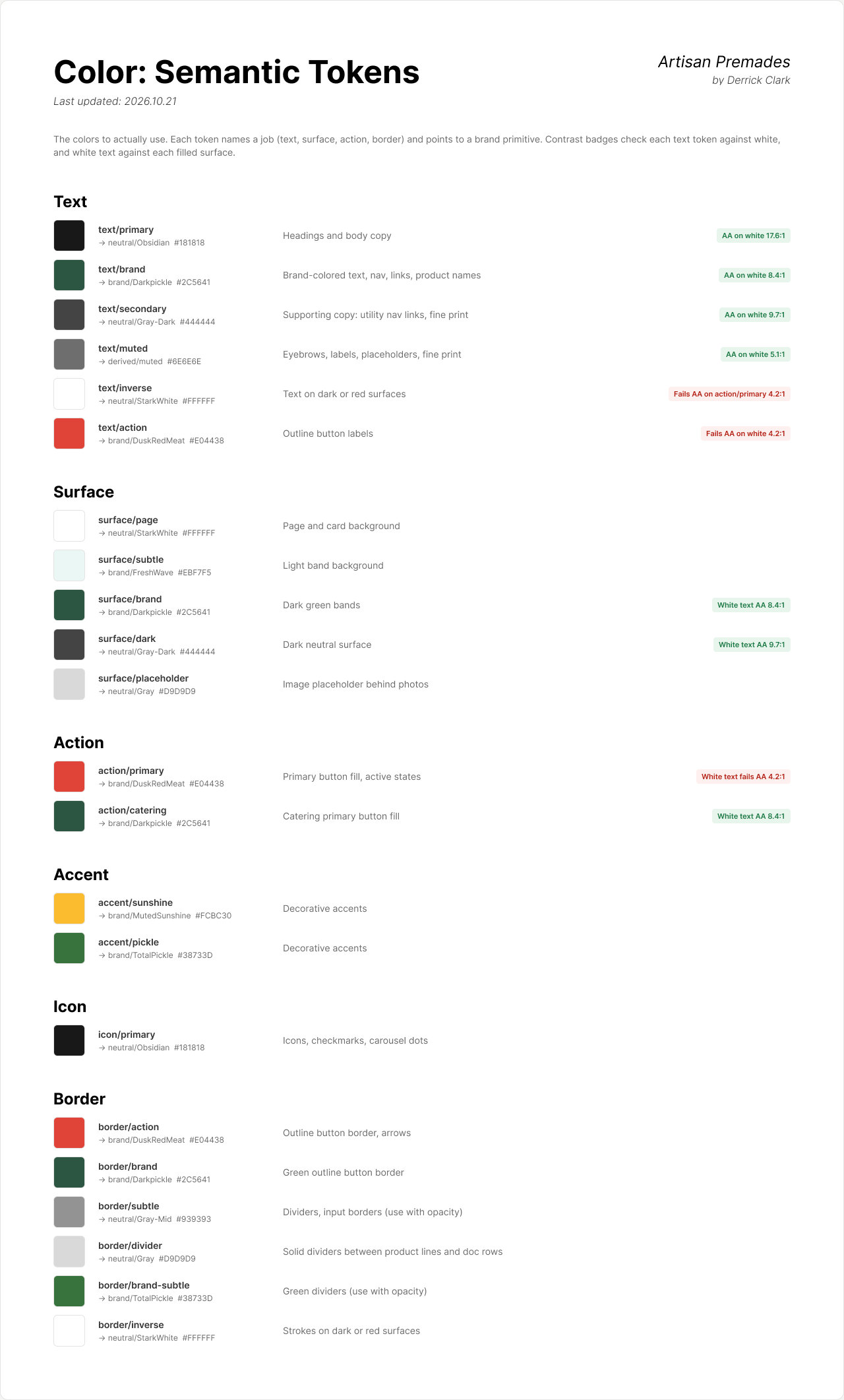
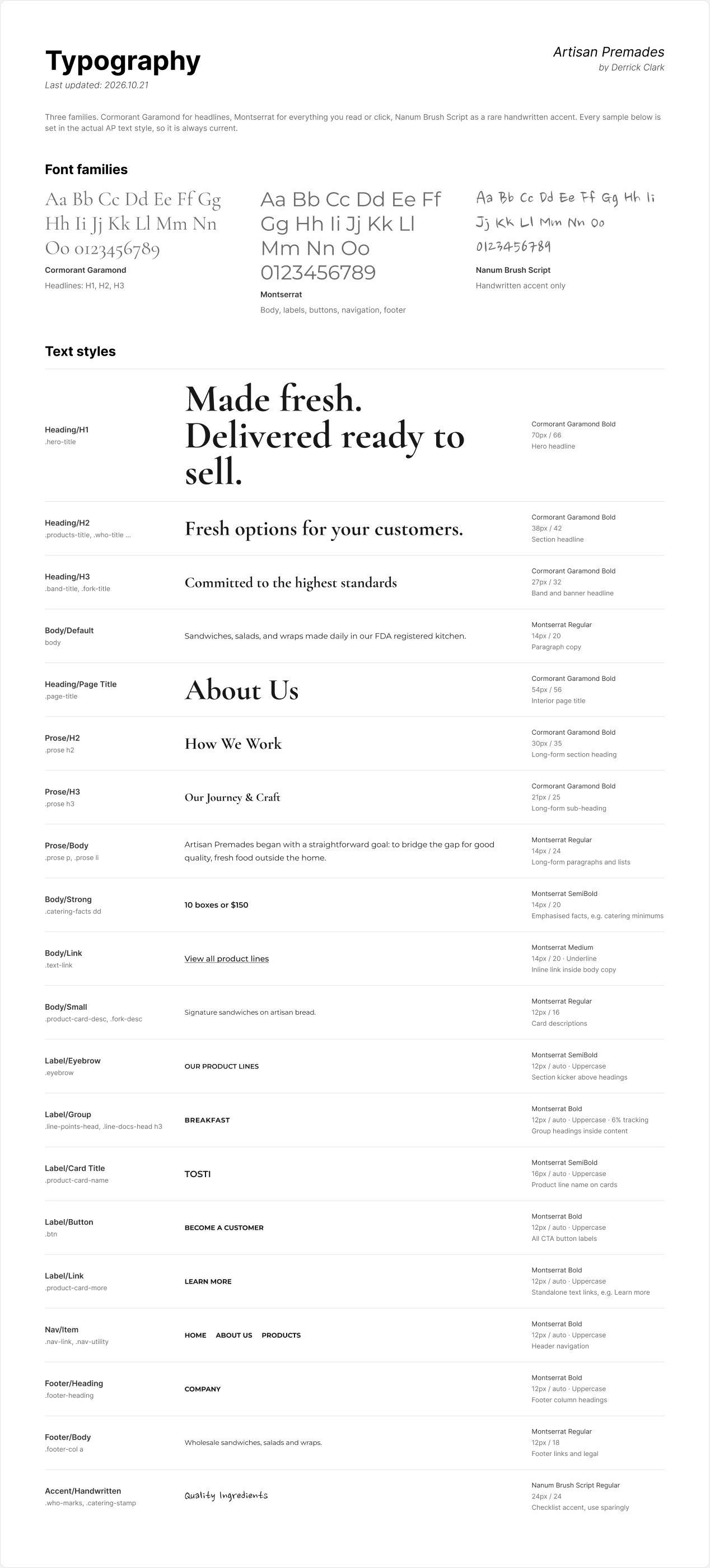
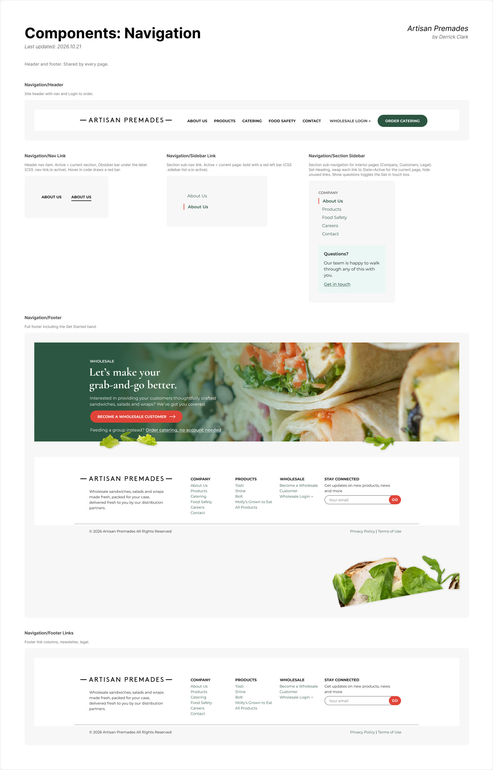
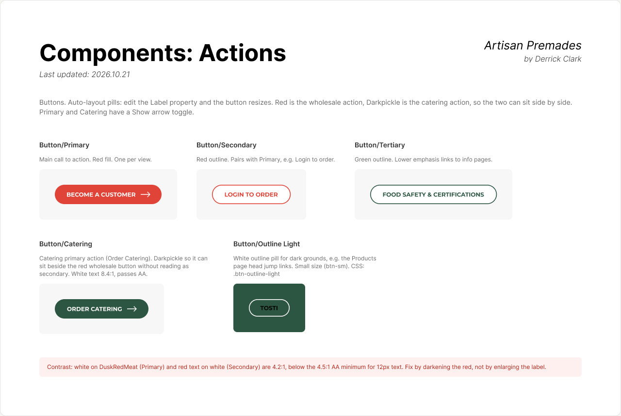
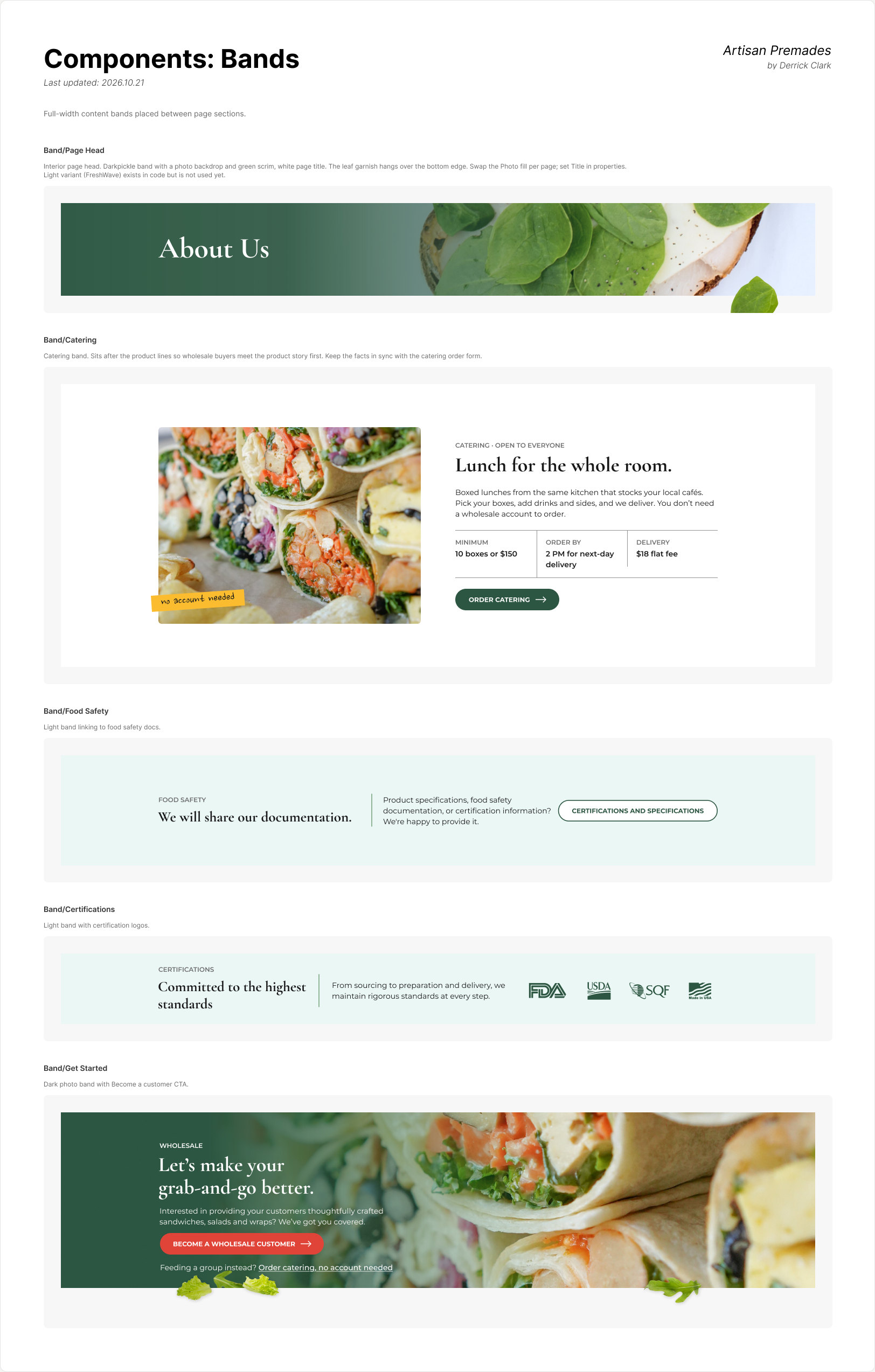
Once the client approved the direction, I went back and rebuilt the Figma file as a real system. It's one board that serves as the single reference for the site, and everything on it is live. If something changes there, it changes everywhere it's used.
I used Claude across the whole project, not just the design. It gave me speed, and it gave me clarity. A solo designer on a project like this also plays project manager, developer and IT. AI let me cover all of those without losing the thread. It didn't make the decisions. Here's where it helped and where I drew the line.
One lesson changed how I work. I jumped from an approved comp straight into AI-built code, and the Figma file fell behind the real site. Building the design system afterward fixed that. With named tokens, text styles and real components, the AI and I are working from the same source. Prompts get more consistent results, and the Figma file and the code stay in sync.
Launching soon
The new site is a static PHP build with shared header, footer and sidebar includes. There's no CMS, on purpose: the client doesn't plan to edit it, and a plain build is fast, cheap to host, and easy for the next developer to pick up. A staging site made reviews easy during the build. The code is version controlled in Git and goes live quickly with one script.